


words by Andy Radtke, photos by Nick Wroblewski
If you’ve been a longtime fan of Kickapoo Coffee, you know of our penchant for the beautiful woodcut design that’s graced our products since the beginning. What you may not know is that it’s all from the remarkable hand of our friend, Nick Wroblewski.
 A product of Minneapolis, 43-year-old Nick moved to Viroqua in 2009, after earning an art degree from Bennington College and spending some years in Minneapolis and Madison honing his craft. He set up shop here and has for years wowed print lovers throughout the Midwest and the whole country with his children’s book illustrations and delicate reductive woodcuts. Think Japanese masters.
We first noticed him while he was still in Madison, when we needed the perfect art for our first products.
“TJ and Caleb knew of my work—they were in the early stages of branding and had the idea to go back to the classic can, and they believed my art, with its bold black lines in combination with soft gradations from nature would work well.” Nick says. Bingo.
By now there’s something special blending here at Kickapoo Coffee Roasters, and it’s not just coffee. You might call it a brewmance. We’ve worked so closely with Nick for so long, we’re practically related. Nick agrees, “What I really like is that they know my family and I know their families and they appreciate those connections. When we collaborate, it’s always a healthy, relaxed environment.”

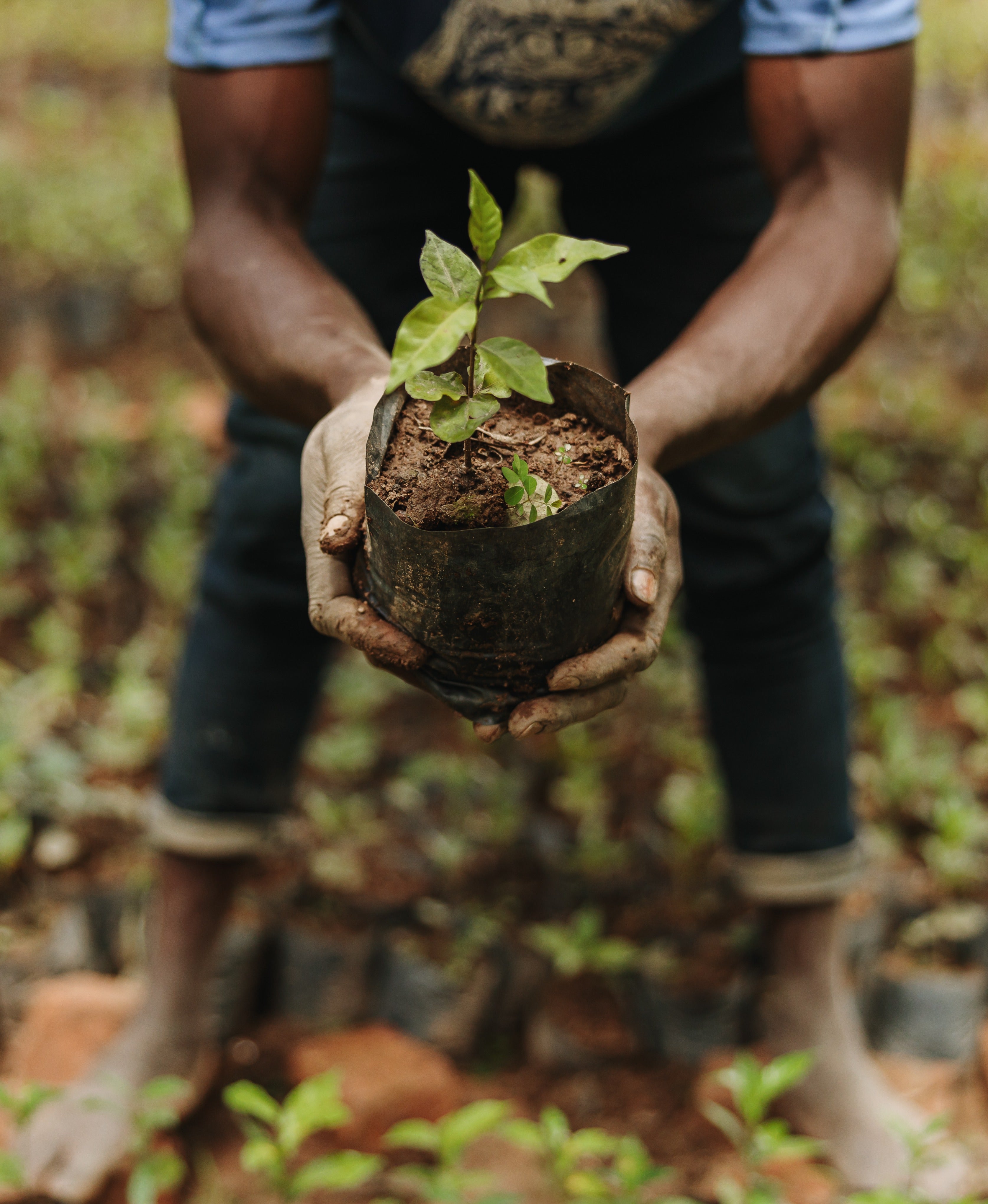
You know how we’re crazy-dedicated to the sustainability of the family farmers who grow the coffee we roast? How we love their attention to environmental care and organic practices? That’s what’s behind the exquisite flavors that flow from place, from the soil up. It’s the elemental terroir you taste in each sip of Kickapoo Coffee.
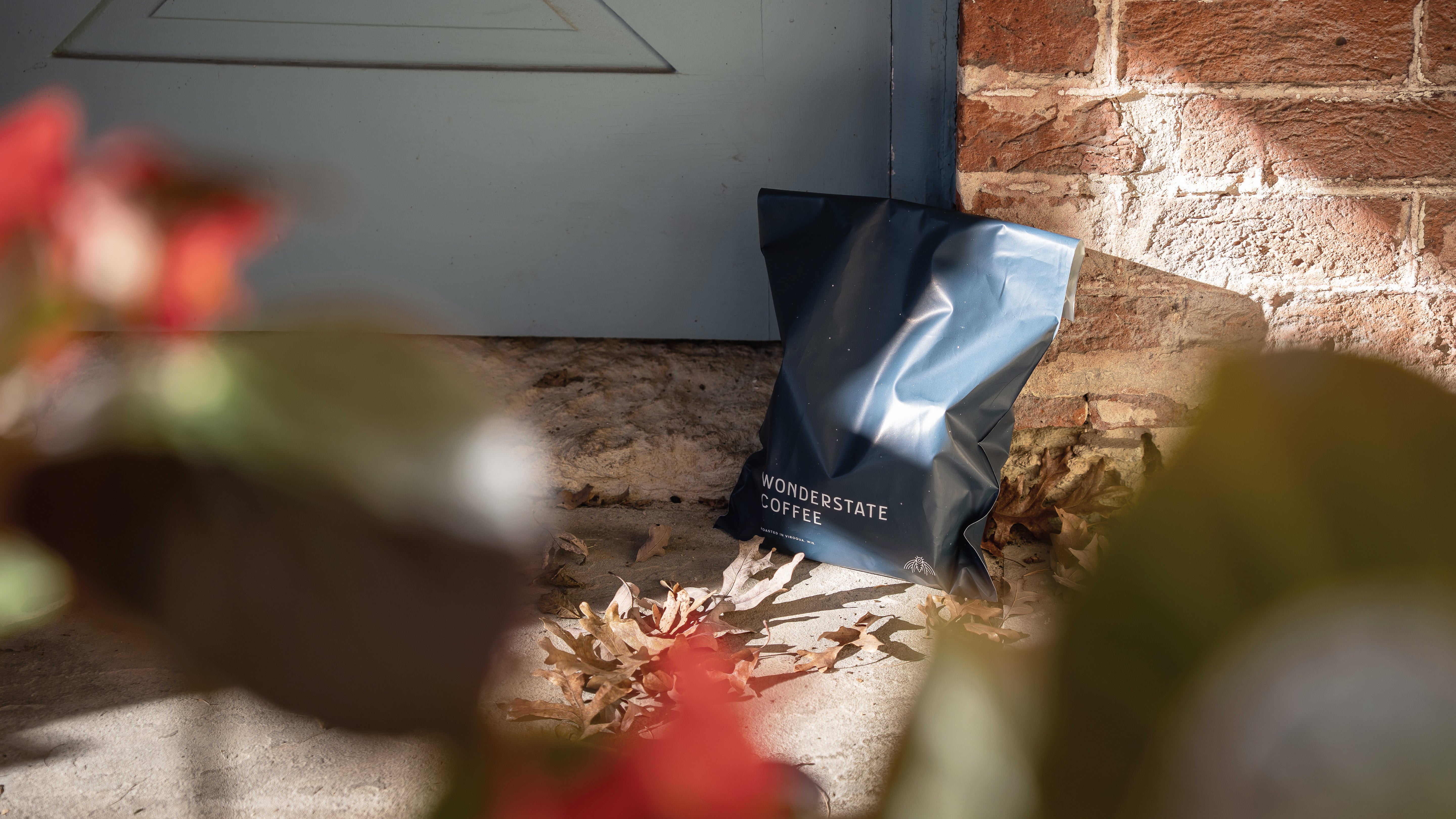
Well, there’s a terroir that meets the eye, too, and it’s every bit as important. Ever since Nick’s woodcut splendor first fired our collective imagination in the early days, when he designed the familiar images on our cans and the coffee leaf emblem of our logo, our friendship has only grown as our admiration of his art deepens. His design sets the perfect tone for our artisanal coffees.
Now, as we introduce our new blends, Nick has done it again, but in a very cool, new direction.
“I’m very grateful for the assignment,” Nick says. “It’s been a little daunting because it’s a different visual language—it’s a little more about the essential qualities of nature. I tried to create a syntax or language that each blend would be explained by.” Instead of the more representational images Nick was asked to design before, the new designs go to feelings, the spark behind the mojo of our java, so to speak. As Nick says, “It’s a little more like playing with fire, a little harder to contain.”
 But a little more fun, too. Nick has noticed that often flavor descriptions of various coffee blends are abstractions themselves, where comparisons to things like pipe tobacco smoke and nuts and such are invoked. Our new blend names do this too, but we’ve gone in a more illuminating direction.
The names of the blend list “conjure qualities of light, of cosmological and astronomical phenomenon,” according to Nick. “They are very nature-inspired and play well with my work that harmonizes the subtleties of landscape, movement, the qualities and vignettes of sky light.”
It’s his goal with the new woodcuts that those essential qualities carry through. Like Kickapoo Coffee roasts themselves, the spectacular quality of Nick’s woodcuts is the result of human attention that only comes from things made by a caring, masterful hand.
We think it’s a match made in heaven. Or, Viroqua at least.

Read more
Kickapoo Coffee received it's fifth accolade at the Good Food Awards in San Francisco last night, this time for our Organic Ethiopia Charbanta Natural Process coffee. Falling on inauguration day, t...
Our Customer Support and Education Specialist, Trevor Gruehn, is a hell of coffee brewer, and he’s looking for some competition. That’s just what he’s found at this year’s USBC Brewers Cup. For...